

Identity, website and launch social for a renewable-energy engineering group
Concept project / self-initiated work by FLARE STUDIO. Atlanor is a fictional company created to explore corporate branding for the energy transition in Morocco and the Gulf. No real client, project, figure or testimonial is represented.
Sector: Renewable-energy engineering (B2B) · Markets: Morocco, Saudi Arabia · Languages: English, French, Arabic (RTL) Scope: Brand strategy · Naming rationale · Logo & identity system · Brand guidelines · Stationery · Corporate website · LinkedIn & Instagram launch kit · Art-direction prompts
The challenge
Engineering groups in the energy sector tend to look alike: a green leaf or a blue swoosh, stock photos of panels under a perfect sky, and promises that are hard to verify. For a group working with governments, industrial operators and investors across Casablanca and Riyadh, that sameness is a real cost — the audience is sophisticated, risk-aware and tired of hype.
The brief asked for an identity that would:
- feel trustworthy and precise enough for a ministry or a lender, yet optimistic and human;
- be natively bilingual — Arabic designed, not translated — and work across Morocco and the Gulf without falling into "Arabian" clichés;
- carry a data-driven, engineering sensibility into every touchpoint, from a business card to a LinkedIn post.
Strategy
Brand idea — "Light, engineered." The region already has extraordinary sun and wind. The value Atlanor adds is the engineering that turns that raw light into infrastructure people can rely on. Everything in the system expresses that passage from nature to engineering.
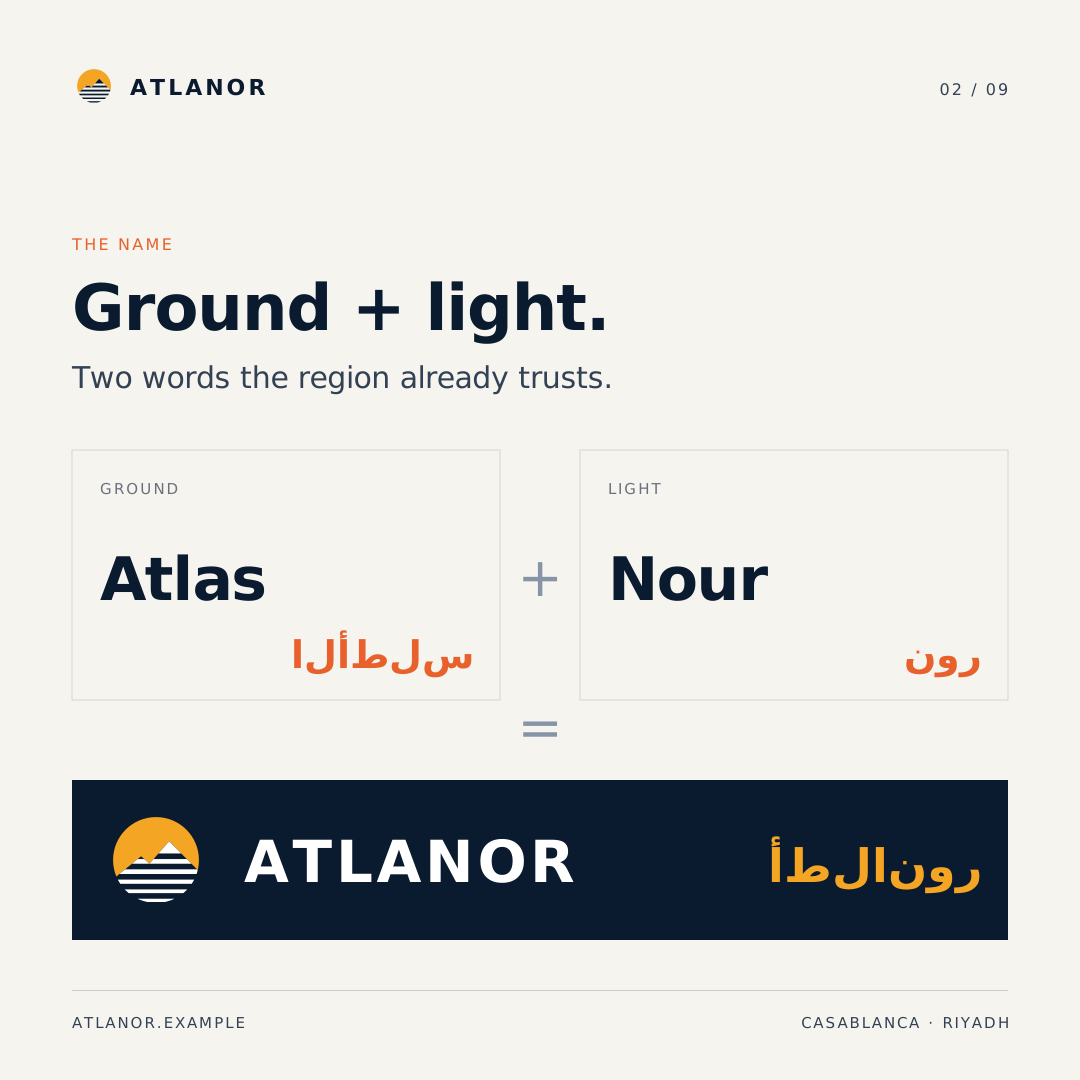
Name. Atlanor joins Atlas — the range that anchors Morocco — and nour (نور), light. Ground and light: the two things every energy project is made of. The Arabic form أطلانور keeps the same sound and the same two roots.
Positioning. For governments, industrial operators and investors in Morocco and the Gulf, Atlanor is the engineering group that turns solar, wind and green-hydrogen ambitions into delivered, measurable infrastructure — because every decision is engineered from the site data up.
Personality pillars. Trustworthy · Visionary · Precise · Human. Translated into a single operating rule used across copy and design: "No number without a source, no plan without an owner."
Tone of voice. Calm, exact, warm. A senior engineer speaking to a minister and a student in the same room. Superlatives and unsourced figures are banned; regional context (such as Morocco's large-scale solar programmes or Saudi Arabia's Vision 2030 targets) is referenced as context only.
The solution
1. The rising mark
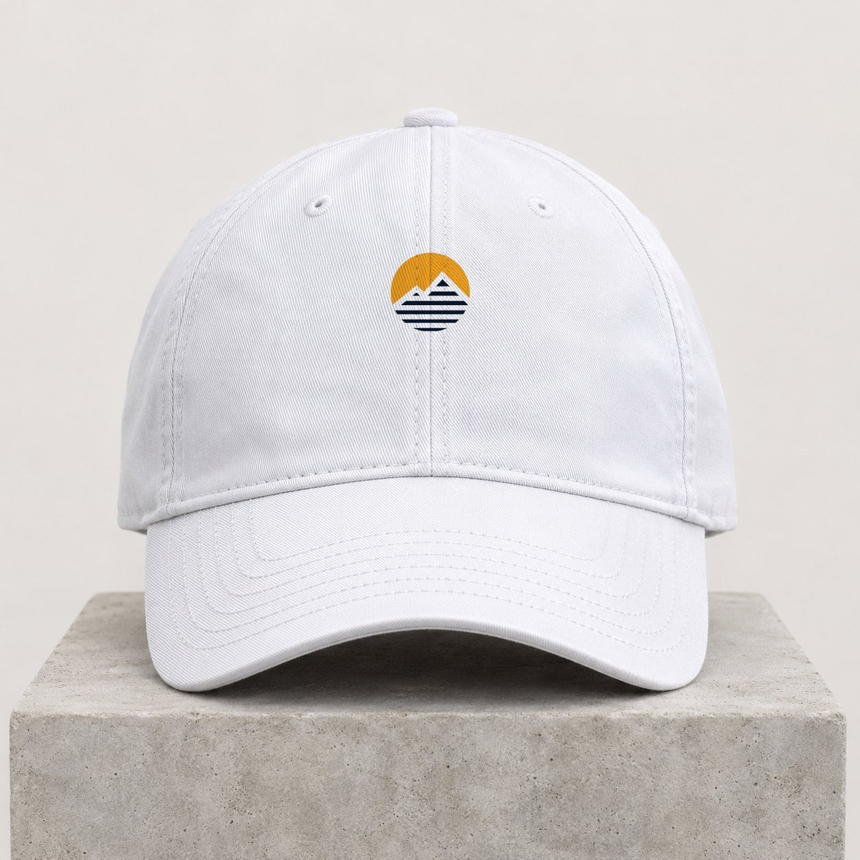
A sun disc cut by a single Atlas ridgeline. Above the ridge, light in its natural state: a solid amber field. Below it, the same light translated into engineered horizontal lines — solar rows, transmission, data. The bands keep a constant 6-unit gap while their weight thins from 13 to 3.5 units, so the light appears to fade into the land. The main peak quietly draws the A of Atlanor.
The mark is built on a 120-unit grid, works in single colour, and the ridge is a negative space, so the symbol survives on navy, white, amber and photography.
2. Bilingual lockup
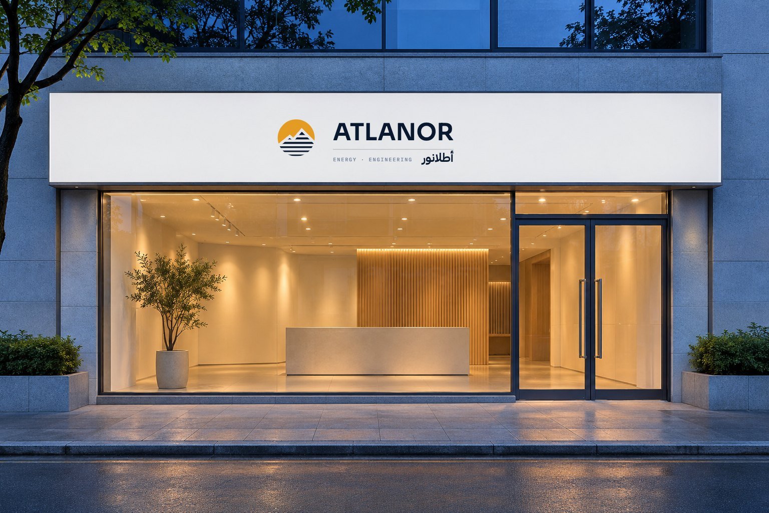
The wordmark sets ATLANOR in Sora (wide tracking, geometric, open) above a hairline rule, with أطلانور in IBM Plex Sans Arabic aligned to the right edge — each script reading from its own side — and an "ENERGY · ENGINEERING" descriptor in IBM Plex Mono.
3. Palette — "from night to sunrise"
The first hour of a working day on site: Night Navy #0A1A2F, Horizon #16325C, Nour Amber #F5A524, Dawn #E8612C, supported by Chalk #F6F4EF, Mist #DCE2EA, Steel #8794A7 and white. Amber is kept to about 7% of any layout so it always means "light". All text pairings are checked for WCAG contrast (navy/white 17.5:1, amber/navy 8.6:1).
4. Typography — one engineered family, two scripts
Sora for display; the IBM Plex superfamily for everything else — Plex Sans for reading, Plex Sans Arabic so Arabic and Latin share the same skeleton, and Plex Mono for coordinates, units and data labels. The mono layer gives the brand its "technical drawing" voice.
5. Graphic language
Three devices, each lifted from the mark: Atlas contours (procedurally generated topographic lines for covers and backgrounds), light bands (the lower half of the mark, extended into dividers, data bars and motion), and a technical grid with coordinate labels for maps and diagrams. A six-icon line set (solar, wind, hydrogen, grid, storage, advisory) completes the toolkit.
6. Website
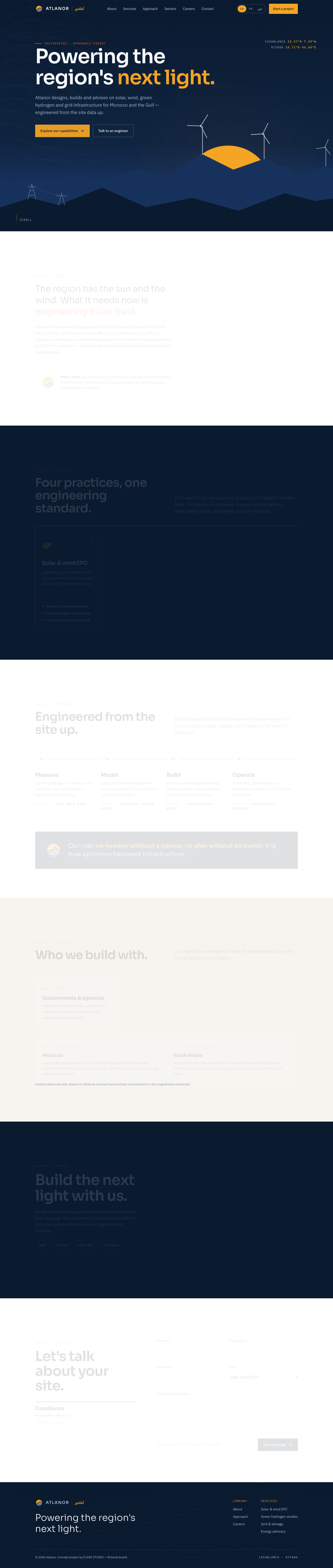
A one-page corporate site — hero, about, services, approach, sectors, careers, contact — with a full EN / FR / AR switch (Arabic sets dir="rtl" and swaps to IBM Plex Sans Arabic; layouts are built with logical CSS properties so they mirror cleanly). The hero is an inline SVG landscape: the sun rises behind layered ridges, turbines turn slowly, and amber bands draw across the land — the mark's story told as a scene. Scroll reveals and a progress line on the four-phase method add motion without noise; everything respects prefers-reduced-motion and works from 375 px up.
Instead of invented statistics, the site uses capabilities language: four practices, two offices, an end-to-end scope, a clearly labelled context section with a disclaimer.
7. Stationery
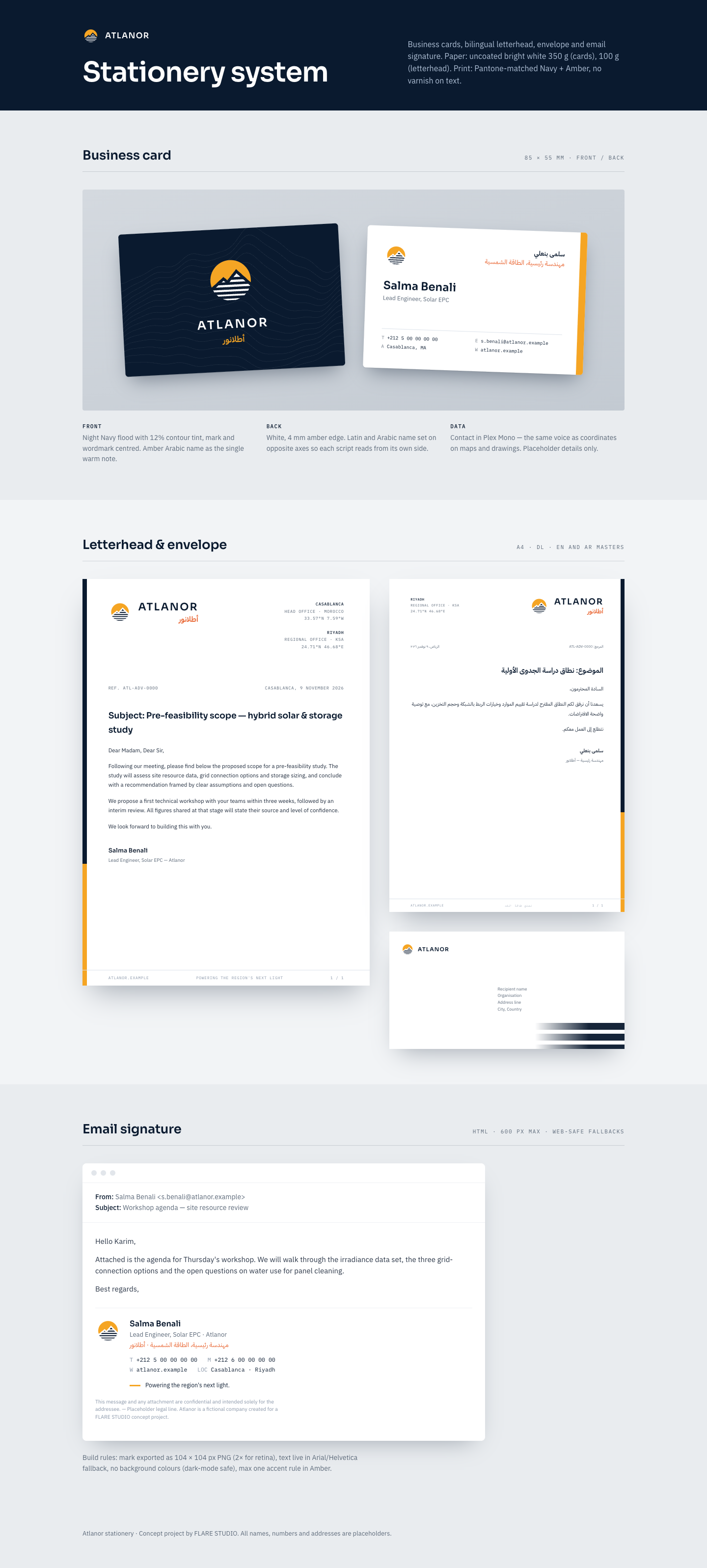
Business cards (navy front with contour tint; white back with amber edge and the Latin and Arabic names on opposite axes), English and Arabic letterhead masters, a DL envelope and an HTML email signature built for dark-mode-safe clients.
8. LinkedIn + Instagram launch kit
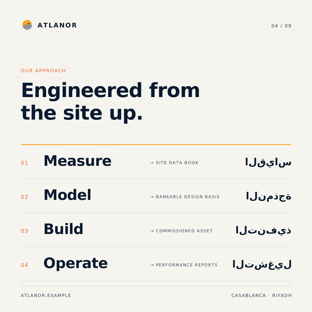
Nine 1080 × 1080 posts in a navy/chalk checkerboard, with one amber manifesto post at the centre of the grid. Each post shares the same chrome (mark and index at the top, URL and offices at the bottom) and pairs a Latin headline with an Arabic echo. Captions are written LinkedIn-first in EN, FR and AR, with Instagram variants (and a light darija touch where it fits), two reel scripts and a one-month calendar. The grid-and-storage chart is explicitly labelled as an illustrative profile.
Deliverables
identity/logo.svg,identity/logo-mark.svg,identity/logo-white.svgidentity/brand-guidelines.html— story, positioning, logo construction and usage, palette, typography, graphic language, imagery, tone of voice, do/don'tidentity/stationery.html— business card, letterhead (EN/AR), envelope, email signaturesite/index.html— responsive trilingual one-page websitesocial/grid.html,social/posts/01–09.svg,social/captions.mdimage-prompts.md— six art-direction prompts for future photography and mockups
Credits
Concept, strategy, identity, web and social design: FLARE STUDIO — self-initiated portfolio project, 2026.