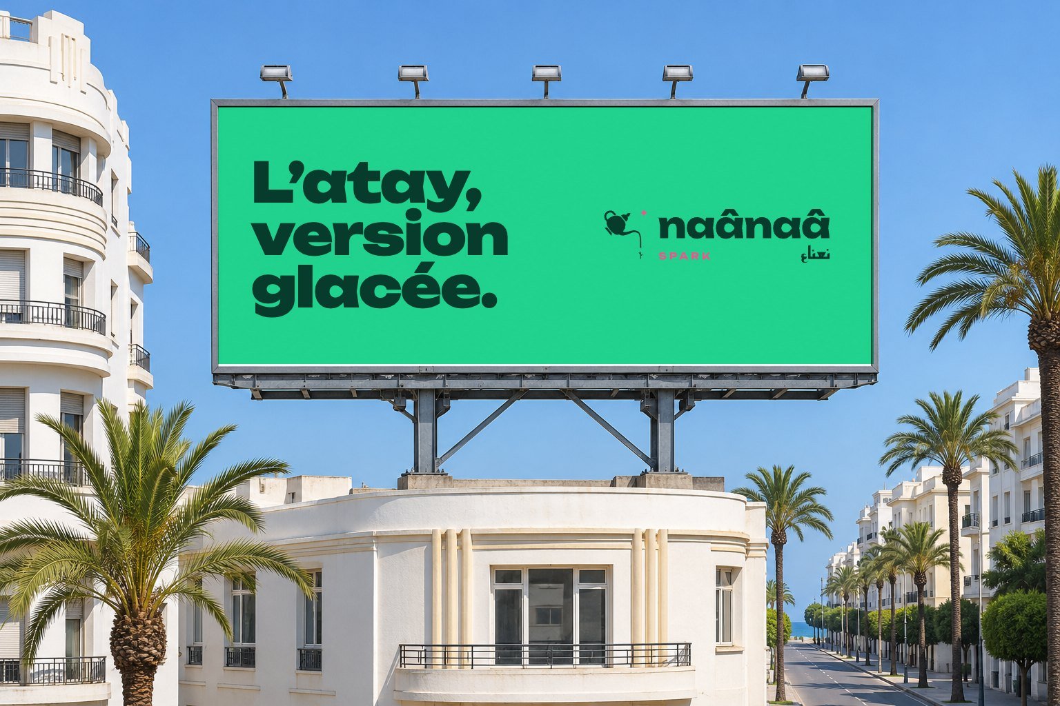
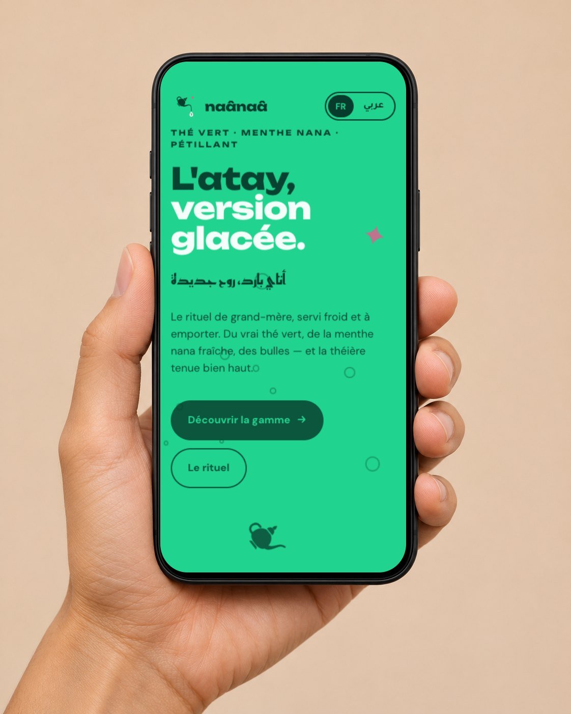
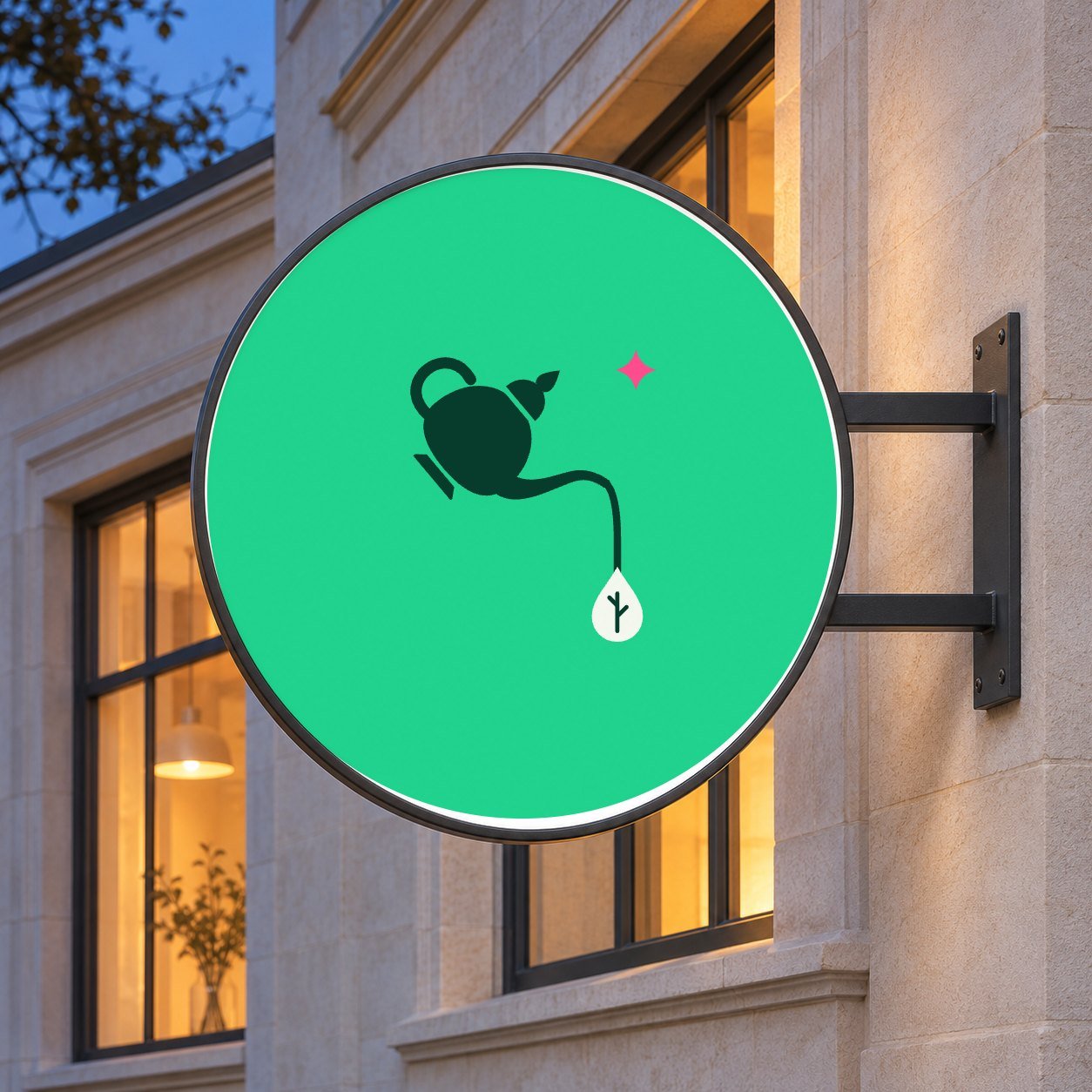

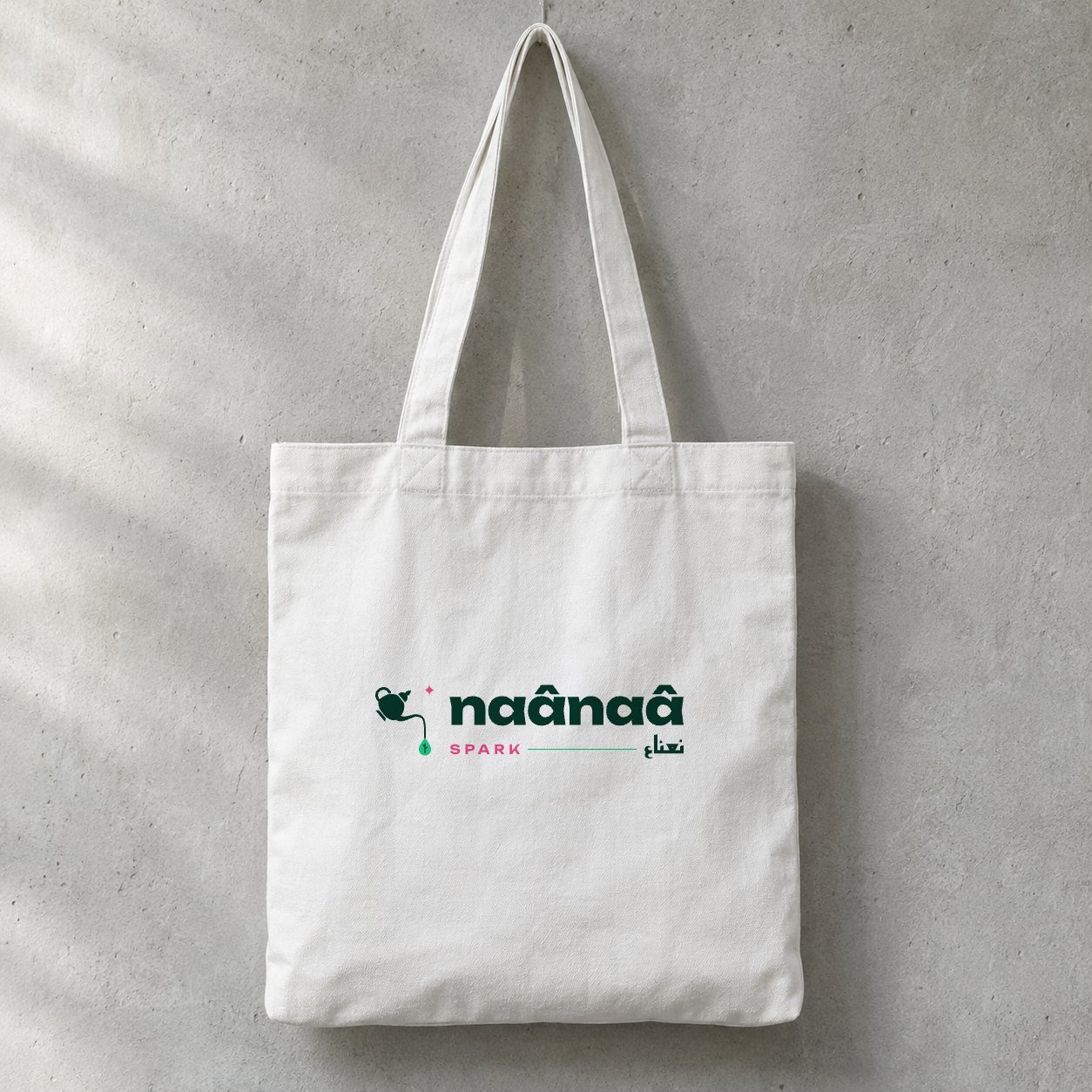
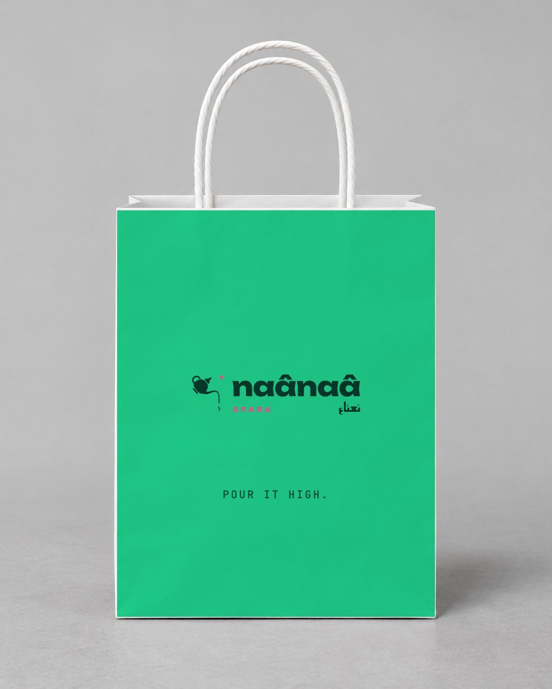


Concept project, self-initiated by FLARE STUDIO. Naânaâ Spark is a fictional brand. The product, recipe and launch plan are speculative, and there are no client, sales figures or testimonials. This case study shows how we would approach the brief.
Sector: Beverages / FMCG · Markets: Morocco (Casablanca, Rabat, Marrakech), then the UAE and KSA Scope: Brand strategy, naming lock-up, visual identity, packaging, bilingual website (FR/AR), Instagram launch kit Languages: French, Arabic, darija
The challenge
Moroccan mint tea (atay) is one of the strongest food rituals in the region. Green tea, fresh nana mint and sugar are poured from high to raise the foam and shared all day long. The ritual depends on a teapot, a tray, glasses and time, so it stays at home and in cafés.
Gen Z and young professionals in Casablanca or Riyadh spend most of their day elsewhere: on the street, at the gym, at the beach, in the office. The cold-drink fridge they open there holds global sodas and energy drinks. Nothing in it tastes like home.
The brief: create a sparkling mint-tea brand in a can that feels proud of its roots without looking like a souvenir. The usual shortcuts were off the table: lanterns, camels, generic arabesques, "Oriental" scripts.
Strategy
Insight. The gesture matters more than the teapot. Pouring from high is something every Moroccan recognises, and it is a joyful, slightly showy move that fits street culture.
Positioning. For the generation that wants atay everywhere, Naânaâ Spark is the sparkling mint tea that keeps the ritual and breaks the setting.
Brand idea: "The grandma's teapot went to the skatepark." The idea holds two forces: respect for tradition and playful urban energy. Every touchpoint has to carry both.
Personality. Playful but never mocking. Fresh. Urban. Proud. Bilingual by nature: French, Arabic and darija sit side by side, the way they do in real Moroccan conversation.
Name architecture. Naânaâ (نعناع) is the Moroccan word for mint, spelt the way it sounds in Casablanca, circumflexes included. Spark stands for the bubbles and the spark of a new generation. The Arabic name is part of the logo, not a translation added underneath.
The solution
1. The symbol: "the high pour"
The mark is a simplified berrad (Moroccan teapot), raised and tilted mid-pour. Its stream falls further than it needs to and lands as a drop that is also a mint leaf. A pink four-point spark adds the "Spark". The whole story fits in one icon: ritual, gesture, mint, energy.
2. A bilingual logotype with equal weight
naânaâ is set in Unbounded ExtraBold: wide, round and confident, with the circumflexes as part of its character. نعناع is set in Reem Kufi Bold, a geometric Kufi with rounded terminals that matches Unbounded's construction. Both scripts carry the same visual weight in the lock-up, joined by a mint rule that echoes the stream. All logo files are fully outlined vectors and need no fonts.
3. Palette: mint, teapot, pop
- Nana Mint
#20D38E: the hero colour, vivid and instantly "fresh" - Deep Leaf
#073B2C: anchor colour, text, and the Mint Zero can - Berrad Silver
#C9D3D4: the teapot's metal, used on can ends and metallic accents - Zhar Pink
#FF4D8Dand Louiza Sun#FFD447: pop accents that also code the flavours - Sugar
#F4F8EF: a soft background, like sugar cubes
Every text/background pair was checked against WCAG 2.1. The guidelines say which pairs work for body text and which are for headlines only.
4. Packaging
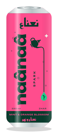
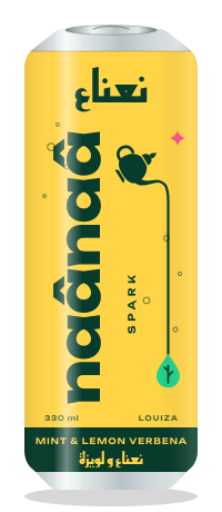
The 330 ml sleek can uses one solid colour per flavour. The wordmark runs vertically along the full height of the can, so it reads from across a fridge. نعناع sits at the top, and a small berrad pours its stream down the side of the can into the mint-leaf drop. The bottom band names the flavour in English and Arabic. Classic Mint (mint), Mint Zero (deep green, no sugar), Mint & Orange Blossom / Zhar (pink), Mint & Lemon Verbena / Louiza (yellow).
5. Graphic system
Four elements come from the symbol: the stream (a vertical line that is always longer than needed), the leaf-drop, the spark and the bubbles (outlined circles that always rise). Together they replace any "oriental" ornament.
6. Website
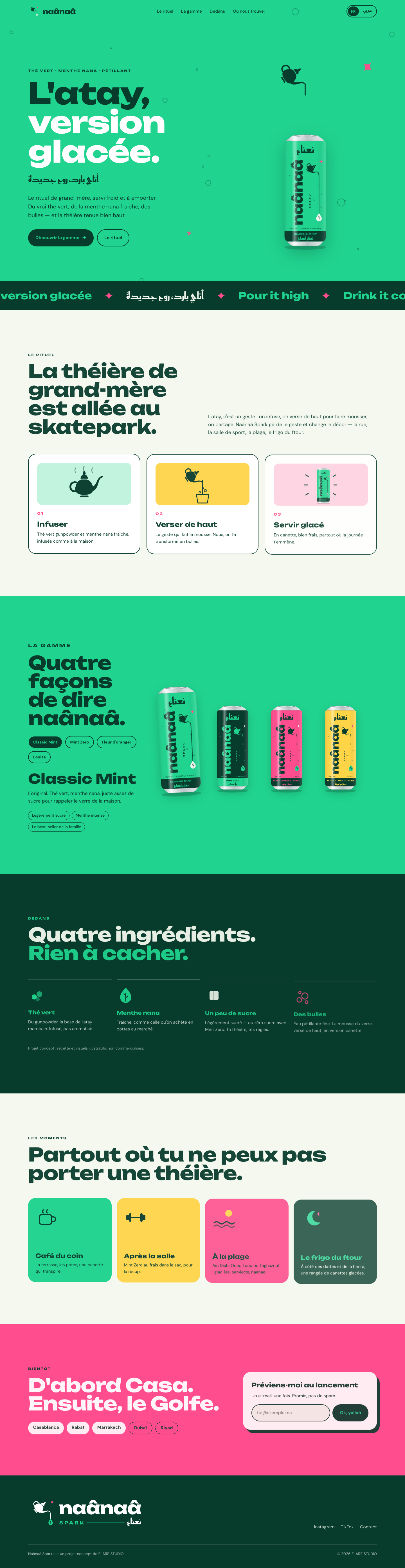
A one-page, fully responsive site in French and Arabic. The language toggle switches to dir="rtl", changes the typefaces (Reem Kufi / Tajawal) and mirrors the layout. The page includes:
- an animated hero where the teapot tips in and the stream pours into the can
- a scrolling ticker in three languages
- an interactive flavour switcher that recolours the whole section
- ingredients, moments of consumption and the city roll-out
- a "notify me" form (front-end demo only)
- scroll reveals that respect
prefers-reduced-motionThe can artwork is inline SVG and needs no image assets.
7. Instagram launch
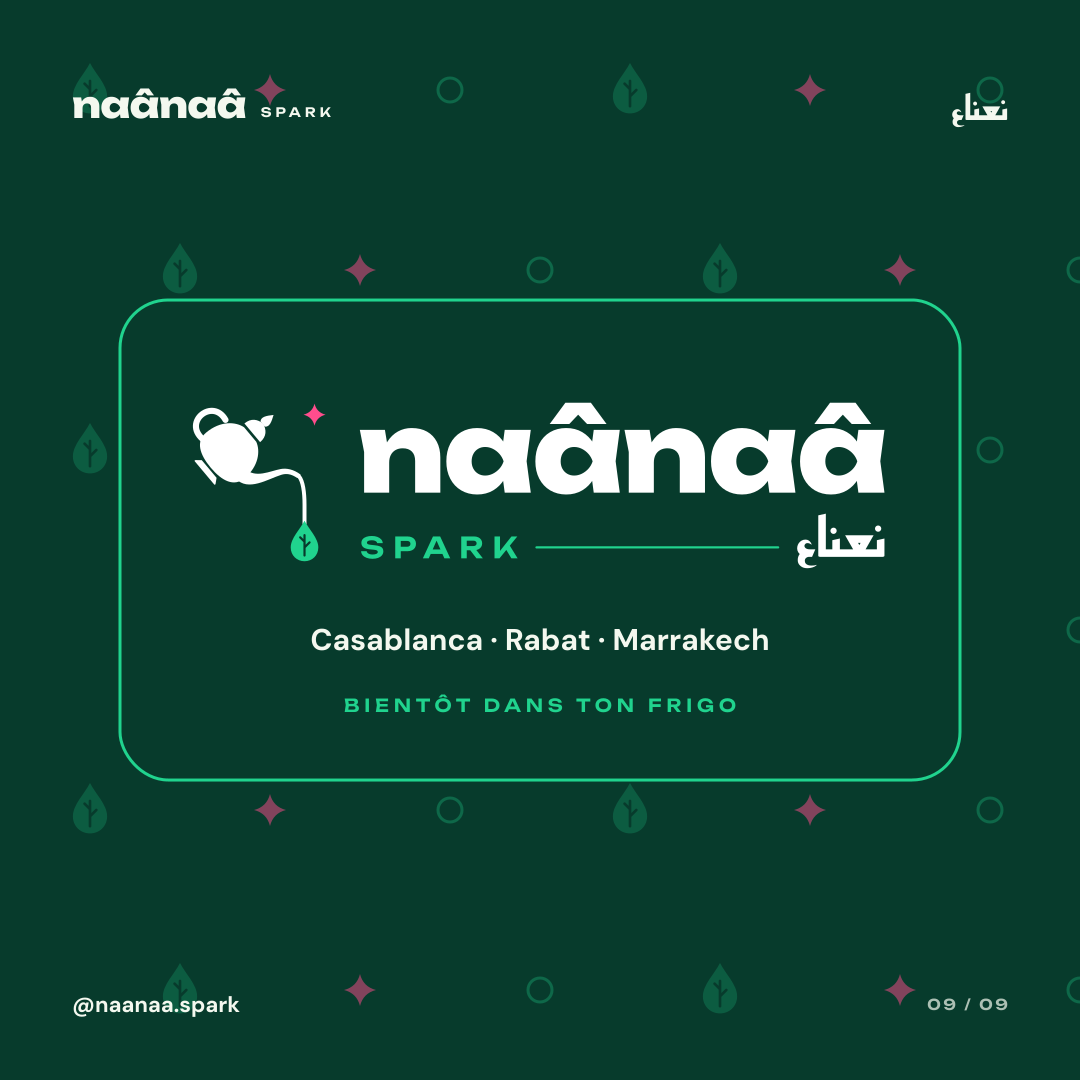
Nine 1080×1080 posts make a 3×3 grid in which no two neighbouring tiles share a colour. They mix the hero launch, the gesture, an Arabic-only typographic post, a darija chat, the range, ingredients and a Ramadan ftour post. The kit also includes FR and AR/darija captions, a hashtag system, two Reel scripts and a four-week calendar.
Deliverables
| Deliverable | File |
|---|---|
| Primary logo, white logo, symbol | identity/logo.svg, identity/logo-white.svg, identity/logo-mark.svg |
| Packaging artwork (4 flavours) | identity/can-classic.svg, can-zero.svg, can-zhar.svg, can-louiza.svg |
| Brand guidelines | identity/brand-guidelines.html |
| Bilingual website (FR/AR, RTL) | site/index.html |
| Instagram grid + 9 posts | social/grid.html, social/posts/*.svg |
| Captions, Reels, calendar | social/captions.md |
| AI image prompts for photography | image-prompts.md |
What we'd do next
- Test the name and the darija copy with 18–30-year-olds in Casablanca and Riyadh, and adapt the Gulf Arabic copy for the UAE and KSA.
- Add a packaging-legibility check in real fridge conditions, plus multipack and point-of-sale displays.
- Run a photography shoot built from
image-prompts.md, with real locations and real people.
FLARE STUDIO: branding, web and social for Morocco and the Gulf.